There is a kind of coastal painting that does everything wrong — neon sunsets, sailboats tilted at dramatic angles, waves rendered in way too much detail. A certain category of beach house is full of these. They don't hold up.
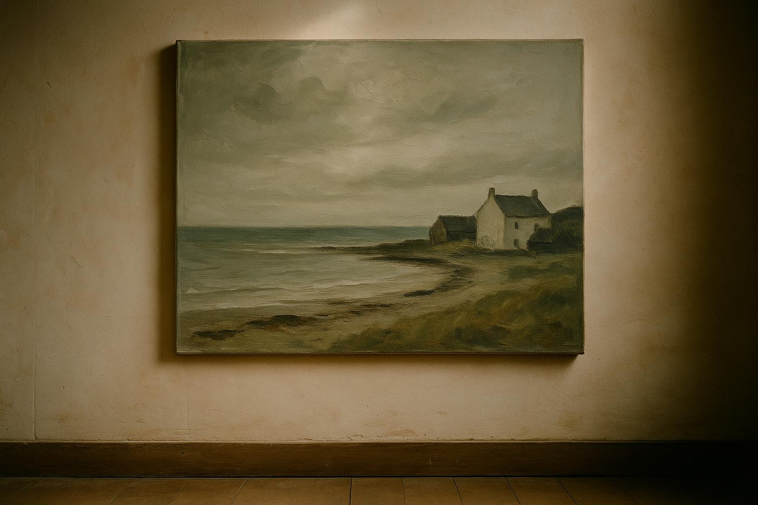
Then there is the other kind of coastal painting, the one serious collectors actually buy, which is mostly grey. These pieces are about what the ocean does to light, not about the ocean itself. They are quiet. They tend to carry a room rather than compete with it. A thing you can live with for thirty years and never tire of.
That's the kind of piece we've pulled for this collection.
The grammar of a good coastal piece
- Palette matters more than subject. A coastal painting in weathered greys and bone white holds up; the same composition in cerulean and yellow ages like a postcard.
- The water should feel heavy. Oil paint and oceans have a specific relationship — good oil painters understand that water has weight, and they paint accordingly. Thin, flat water is a tell.
- Look for horizon line discipline. Where the artist puts the horizon tells you a lot. Low horizons feel vast; high horizons feel intimate. Neither is wrong, but the piece should know which it's doing and commit to it.
Every piece in this collection is a one-of-one original, painted by a hand that has spent time around real coasts. Most are oil; a few are watercolor or mixed media. All ship rolled and insured with a Certificate of Authenticity.